


Scope:
Through the use of dashboards and visuals in power BI using datasets obtained from credible sources, my group and I were given the task to obtain an answer to the question “Is Singapore a good place to live in?”
My role and solution:
For this project, I was in charge of delegating tasks and dispersing the workload so as to not cause anyone to be overworked. I also provided critical insights and perspectives to keep my team to realistic timeframes and ideas. I made sure to make use of everyone’s skill sets and talents. Hence, some of my group mates were in charge of integrating the various datasets from our previous iterations, and others, like myself, took charge of storytelling using the visuals and dashboards. This was because my friends felt that I could articulate and piece together information rather proficiently.
My solution to test my hypothesis was to find datasets that showed changes and data over time, so as to coincide with my hypothesis which was based on time. I tried my greatest to make use of as many time-related datasets to allow it to be representative. However, there were many limitations in that aspect as some datasets did not cover enough years.
Work process:
There were countless facades and aspects that we had taken into consideration when trying to determine what gives the best gauge of quality of life in Singapore. After narrowing down and filtering the various topics, we decided to dive deeper into these 4 topics:
-
Sport
-
Singapore Healthcare System
-
Food accessibility and quality (My chosen field of research)
-
Singapore Transport System
Data collection, preparation and organisation process
-
Gathering datasets from sources like statista and github
-
Verifying sources and quality of data
-
As we began research and gathering datasets, we had to make sure they added value and insight for our respective areas of focus. On top of that we have to check for the quality of the dataset. This can be derived from the source of data and the database it has been published on. Furthermore, I had to ensure that the data is relevant which can be derived from the release date and the timeframe of the dataset itself. Some of the datasets were not representative enough as their time frame was too narrow (there were not enough years to derive a trend or )
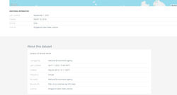
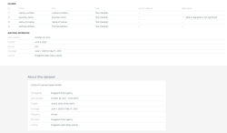
Examples of Credible Datasets and its additional information
 |  |  |  |  |
|---|
Data collection, preparation and organisation process
-
To extract the data, I had to download the dataset provided into a suitable format. More often than not, it came in the form of an excel file (.xlsx) or a comma-separated value file (.csv) These were the 2 main file formats for all my datasets. Using the example of Statista, by just clicking this simple icon, I could immediately download the excel file. For datasets from places like data.gov, I was given a zipped file that I had to unpack and extract within my file explorer.
-
For the whole process of cleaning and filtering the data, some steps were taken in Power BI.
-
I removed the empty rows in power BI by utilizing the __ function
-
I deleted any empty cells and formatted the data accordingly
Problems encountered
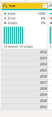
Problem 1 (Year Data Type)
Adjusting data type of year to work smoothly
For most of the year values, I had to convert the data type from “number” into “text” before converting it to a “date” format so as to enable the data to be properly modelled.
-
View the image gallery here to see the steps I took to overcome this issue
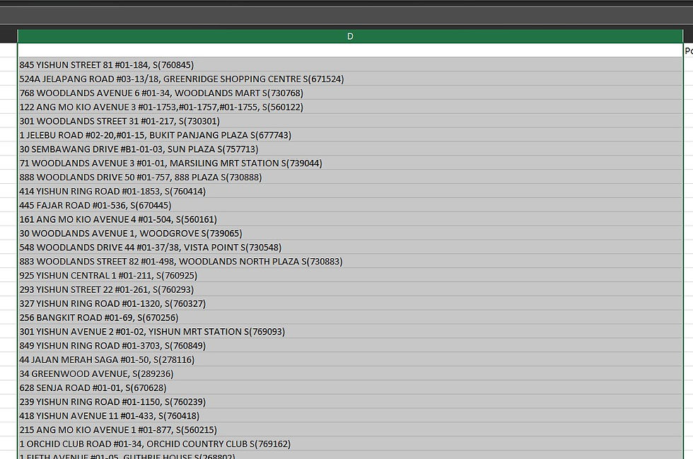
Problem 2 (Extraction of Postal Code for Supermarkets)
Extraction of geological data
-
Some of the Geological data was not consistent and therefore I had to intervene and manually adjust some of it. I had to transform the data into a new row such that only the postal code, which is at the tail end of the address line, was extracted.
-
However, I encountered even more problems after that. For example, some of the postal codes were situated at different portions in the address line, which made it a lot more complicated and troublesome to extract as it was not in a consistent position.
-
Additionally, numerous postal codes had a leading zero in it. For example, S038194. However, when excel sees numbers, it automatically classifies it as a number and removes the leading zero. (058 = 58) Therefore, I had to ensure that the numbers were saved in a text format and then I had to add the zeros manually. It was a tad bit time consuming, but it allowed me to be absolutely certain that everything was in order
Below are the images for the processes above, in chronological order. Click here
The “Year” column was originally in “whole number” format
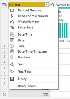
I had to select the “text” type first
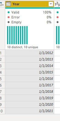
And the final product is this.
The “Year” column was originally in “whole number” format
Problem 1
The images on the left showcase the problem and how to solve, in order of events. Please click on it to view the image in its totality, for better readability

Problem 2
The images on the left showcase the problem and how to solve, in order of events. Please click on it to view the image in its totality, for better readability
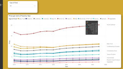
Visual Charts Used
 |  |  |  |  |
|---|---|---|---|---|
 |
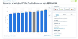
In Conclusion
To summarize, the dashboards and visuals I have created with my group have led me to the conclusion that Food in Singapore is indeed becoming more accessible, and therefore Singapore is becoming a better place to live in. Click HERE to view the power BI dashboard